Atlantic hack day project: Giving you great journalism in every browser tab
Reposting something I wrote for The Atlantic’s product blog..
Every so often on The Atlantic’s Product team, we drop what we’re doing and spend a day messing around. Lots of whiteboards, some frantic coding, usually ending with presentations over beers. We call it a “hack day,” but I think of it more as a talent show for ideas — a chance to take all those concepts we’ve been privately mulling, put them on stage, and see how they perform.
Today, we’re publicly launching one of the reader-focused projects we prototyped at our last hack day: Serendipity, a Chrome and Firefox extension that displays an awesome piece of Atlantic journalism every time you open a new tab.

What it does
Are you on your desktop computer? Hit Cmd-T (or Ctrl-T, if you’re on a PC).
OK, now come back. Are you back?
Good. You probably saw an empty screen, or maybe a Google search bar. Chances are, you don’t think about that page. It’s a blank nothingness, waiting for you to type a URL.
We saw a canvas.
As I’ve written before, I’m fascinated by the concept of serendipity, the collision of unrelated things that result in something new. True serendipity is rare, but it can be encouraged. I think that’s what we’re trying to do when we publish a magazine: We take a bunch of ideas, bundle them together, and deliver them to you for inspiration.
With The Atlantic Serendipity, we’re aiming to do the same thing. With every new tab, it surprises you with a new piece of journalism. Maybe the article catches your eye, and you read more — or maybe it doesn’t, and you finish typing in the website you were going to visit.
Either way, you get a bit of delightful (we hope!) randomness, and we get a chance to show you a piece of writing or video we think is really good.
How we built it
When the team (Ana Carano, Thanh Do, Kevin Mahoney, and Carson Trobich) huddled up on Hack Day morning, the only thing we knew was that we wanted to put The Atlantic on someone’s Chrome tab. What it looked like, or even how we’d do it — no idea.
Our first step was to look at the competition. Here are a few extensions we found helpful for inspiration:
- Momentum, the grande dame of them all, with more than 11,000 reviews on the Chrome store. It puts a clock, a quote, and a beautiful picture on your browser, and greets you by name. It also has a number of optional widgets.
- Wallcat. Like Momentum, it displays a new piece of stunning photography every day.
- Wandertab. This one is fun: It features airfare deals from the location of your choice, updating frequently.
- Mainichi. Kevin and Thanh were fans of this one, which drops in a flashcard of foreign language vocabulary into each new tab.
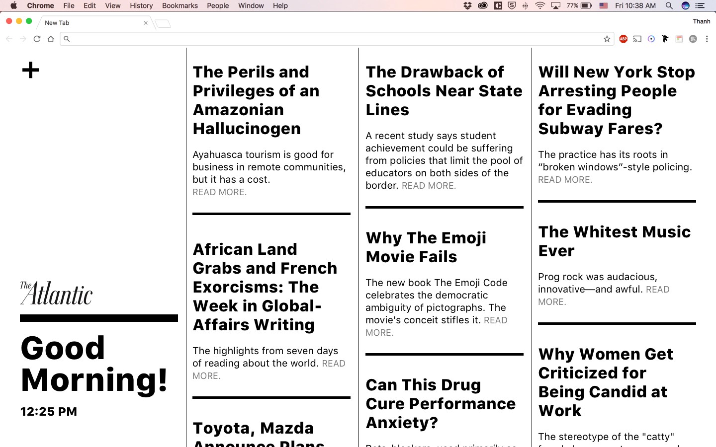
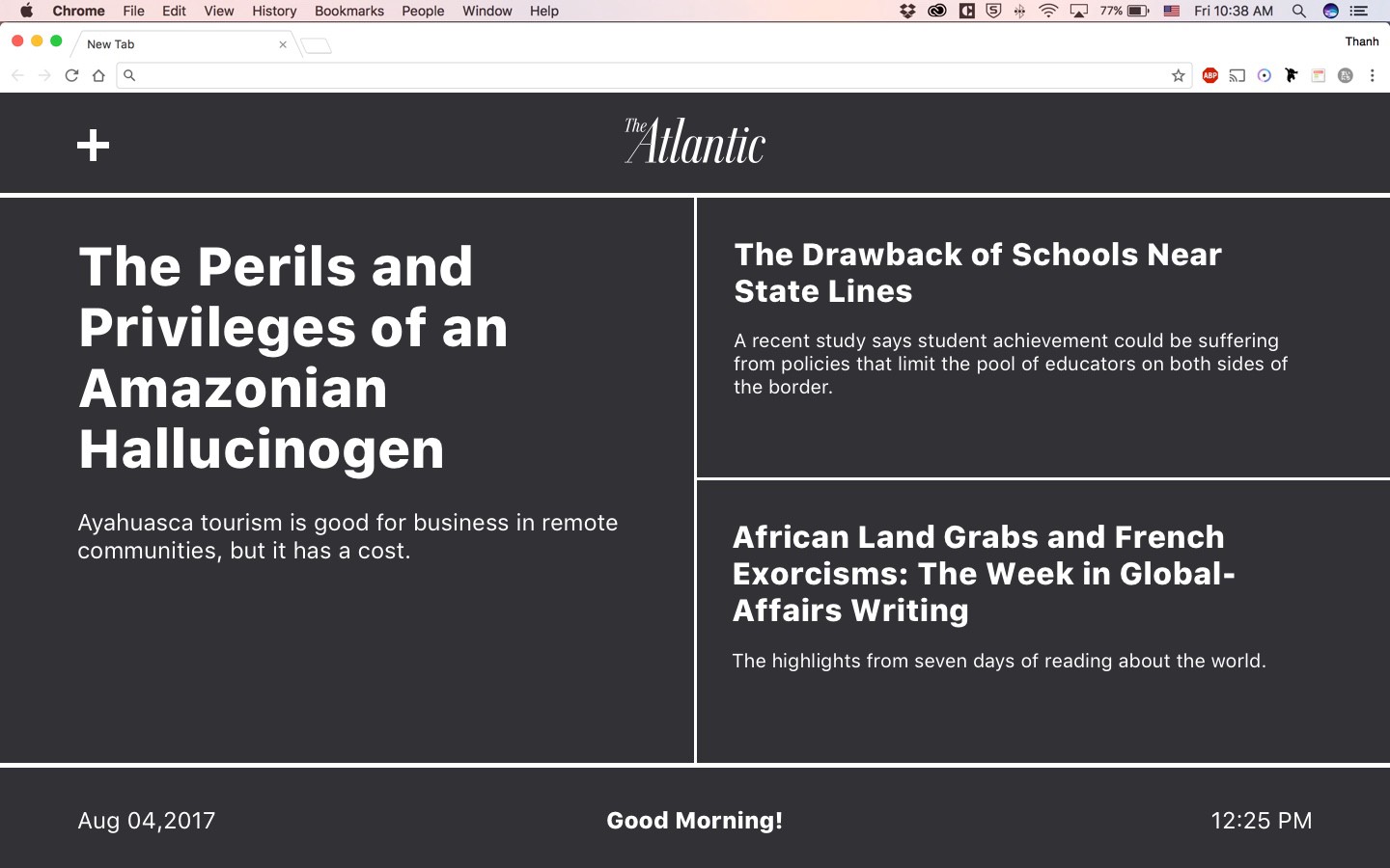
After some initial brainstorming, Thanh put together some sketches of three approaches, varying in density and tone:


By the end of hack day, we had semi-interactive version of the second design ready to show the rest of the Product team. Folks were intrigued. There were a few complaints, however:
- It was monochrome, and didn’t feature any of the photography or graphic art that usually accompanies our stories.
- Even with just three stories, it was a bit dense.
A week or two after the presentation, I went back to the drawing board and mocked up a simpler version, featuring just one headline, and using our new display font, Noe:

Hm! Much cleaner. For variety, I played around with having the background tint change every time, cycling through some of our new brand colors. (I also attempted a misbegotten adventure with a shifting animated gradient, which nearly sent my computer’s CPU marching to the picket lines.)
But was there a way to integrate photography? Turns out that a good number of our display photos looked decent behind the headlines, so long as they were toned correctly to avoid conflicting with the text. I also added an Atlantic logo and a “Next story” button, so people could cycle through without having to open new tabs.

Right now, the story-recommendation algorithm is simple: We’re just using the our homepage’s RSS feed. The first time you open a new tab, Serendipity pulls the latest stories and stashes them in your browser’s local storage; that means it works even when you’re not connected to the internet (though the photos don’t show up.)
Every time you pop open a tab, it shows you a different story. After 30 minutes or so, it’ll check back with us to see if there’s new content.
What’s next
In October, we debuted Serendipity to The Masthead, The Atlantic’s membership program. Based on their feedback and new responses from you, we’ll be updating the extension as time permits. Some of the ideas we’re fielding:
- A “back” button,for those times you glimpse an interesting story just before gmail.com or facebook.com loads;
- A “quiet” mode, where the same story is shown to you on every new tab, refreshed every half-hour;
- An accessibility theme, losing the image and switching to high-contrast font and background colors.
We’ll see — it all depends on what our readers say. And so I hope you’ll give Serendipity a try! And please let me know what you think at andrew@theatlantic.com. Excited to hear from you.
Endnote: The New Yorker has published their own cool new-tab Chrome extension here.