Why don’t we have news apps as fun as TikTok?
I’m newly obsessed by TikTok, the social video platform that combines the best parts of Vine and a casino slot machine. Its interface is easy. IT shows me just one thing at a time. And the algorithm powering it is uncannily good at learning my tastes and serving up what I like.
Why aren’t more news apps like this? I recognize there’s a big difference between quality journalism and funny videos, but I don’t see a single major news app emulating the awesome, serendipitous user interfaces we’re seeing from social media companies.
I think three things apply:
- News apps (and homepages) are generally organized around breadth. They want to show you all the stuff that’s going on, instead of directing your attention to a single thing, or series of things.
- New organizations prize curation and editing, and are reluctant to surrender that judgement to algorithms. (Vox and Flipboard use computer logic to determine the best homepage layout, but not the stories being displayed.)
- News apps don’t want to look frivolous. A lot of the newest ways to navigate apps – swiping, tapping – have been pioneered by companies news orgs would rather not be associated with. No editor-in-chief wants to hear, “Oh, your app is just like Tinder!”
I’m not arguing that these positions are wrong – though I look askance at being conservative for conservativeness’s sake. But I do wonder if a more serendipitous, easier-to-navigate news app would appeal to people in interstitial moments, those times when you’re waiting in line or taking a Lyft and just want something to occupy your attention.
A few apps (Economist Espresso, Refinery29 This AM, the now-defunct Quartz Briefing) have tried to hit this target. But right now, my go-to is TikTok or Instagram. Is there room for something more intellectually fulfilling?
A proposal
I’d argue a place like The Atlantic actually has a good mix of content for a TikTok-type app. Instead of simply relaying the news, most of its stories consider a question or pose an argument. And a lot of its stuff falls nicely into the “wonder-and-delight” category that could grab people immediately.
Here’s how it would work:
- First, get good content. Pull The Atlantic’s 500 best-performing stories, and strip out political news. That way, we get stories we know people have enjoyed, but are also less likely to be flash-in-the-pan spot coverage.
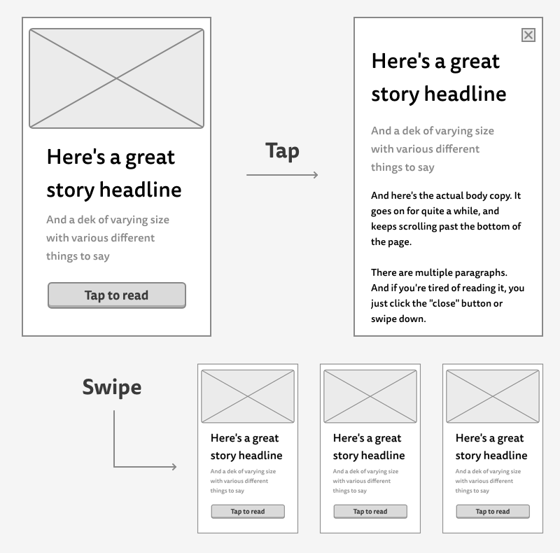
- Guarantee a surprise. Every time the reader opens the app, it shows them a new single-screen promo to an interesting story. It can be simple – maybe just the headline, a deck, and the amount of time it would take to read the full story.
- Give them a choice.
- If the reader is interested in a story, they tap it. A screen pops up with the full story text, which they can scroll through or dismiss.
- If they’re not interested, they swipe up. Boom! They get a new story.
- Keep doing this forever. Once the reader swipes through the first set of stories, we pull another 500.
We’d need to record which stories they’ve read or swipe through, so we avoid showing them again. And it might be nice to have a “save-for-later” function – if they’re interested but don’t have enough time in the elevator, they can bookmark a story.
Now, I’m not saying this replaces an organization’s news app. It’s still important to have the editors’ voice saying, “These are the stories you should read!” But as a complimentary app, or even a tab within a larger site, I think this could be pretty fun.