What building a prototype baby poop app taught me about design systems
(Just want to see the poop app? Here’s the InVision prototype.)
I lead the Interactive News team at POLITICO, a collection of coders and designers based in the newsroom. Since we don’t have the burdens of a traditional product team — we’re not worrying about maintaining our article page, for instance — we travel light and approach each project design as a blank slate.
But! As we tackle ever bigger stuff, I’m realizing the importance of defining design systems early, both for individual projects and the team at large.
Honestly, I thought we were covered because we already use component libraries, first in Sketch/Figma and again in code with Storybook. But without a more fundamental plan in place for big projects, we were traveling without directions — which often led to a bunch of arguments along the way.
A design system:
- Helps us figure out the objectives we’re trying to achieve;
- Forces us to make decisions early about basic stuff like colors and typography;
- Serves as a baseline we can rely on for every other aesthetic decision.
We’re relaunching our election forecast soon (more on that later), and since it’s a big multi-page project, I really wanted to build a design system. But … I was stuck. I’ve never made one before. It felt overwhelming.
So instead of jumping right in, I decided to take a practice shot — with a poop app.
Yes, poop
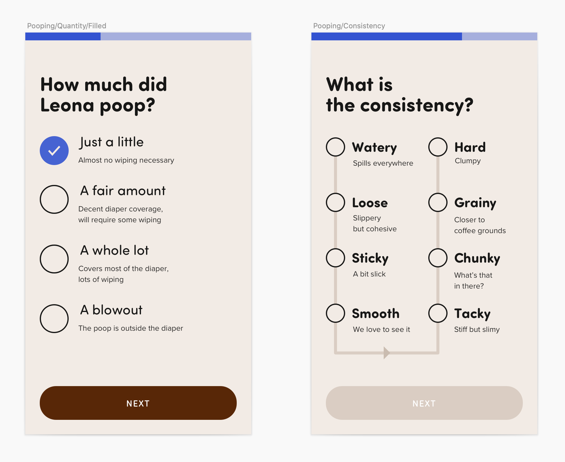
As a new(ish) dad, I am now very interested in baby bowel movements. When my daughter was younger, we used to track every poop with an app that was kind of janky. It always felt rote, something we had to do in case her pediatrician asked us for info. I always wished the app could give me better direct feedback — ”hey, way too much pooping!”
Two birds, one stone — I could practice building a design system and sketch out the poop app of my dreams. And I already knew the name: Poopsy.
A few books were really helpful in getting me started:
- Expressive Design Systems by Yesenia Perez-Cruz
- Atomic Design by Brad Frost (a bit heavier on component stuff but still useful overall)
- inVision’s Design Systems Handbook
Defining Poopsy’s priorities
I pulled most of this first part from Expressive Design Systems. Perez-Cruz suggests starting with a purpose statement explaining what you’re trying to accomplish. It’s actually a series of four questions.
- What is the goal for the design system? To create a suite of products that are easy — and fun! — for busy parents to use.
- Why is that goal important? If a tired parent has any trouble using our tools, they’ll bounce. And giving them a taste of delight will make their harried lives a little brighter.
- How will it help us? By giving us a shared set of tools to craft clear and delightful experiences with.
- Who is it for? Our design and product team (aka me 😉).
Pretty straightforward. Next, a bit tougher: I had to settle on a set of design principles that would embody Poopsy’s aesthetics.
These can be as complicated as you want, but I like the simplicity of single words — Salesforce has defined theirs as clarity, efficiency, consistency and beauty.
Here are Poopsy’s:
- Confident: Give parents confidence amid uncertainty 💪
- Simple: Busy parents don’t need additional mental load 💎
- Mischievous: Tracking poop just shouldn’t be this fun 🤪
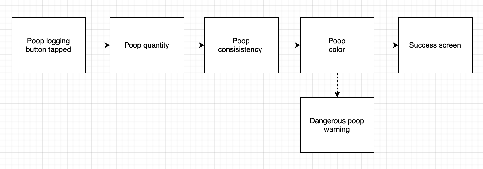
Lastly, Perez-Cruz recommends conducting an inventory of your user interface, pulling together similar components and generally bringing order to chaos. Since Poopsy wasn’t real, I instead built user paths that I would later use to design actual screens. Here’s the “flow” (sorry) for adding a new bowel movement:
Typography & color
Now I knew I wanted the app’s design to feel confident, simple and mischievous. Cool! Time to put that into practice.
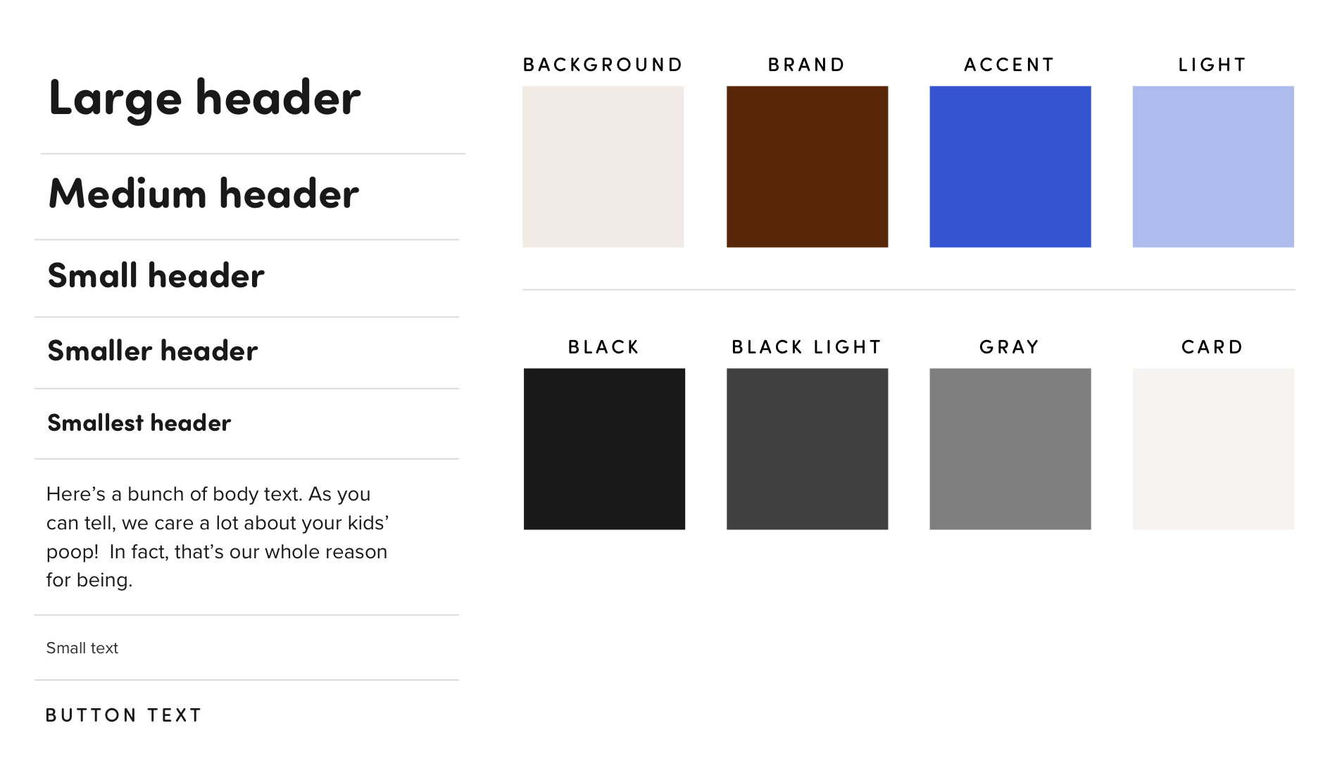
The next decision was my primary typeface. The winner was Sofia, a rounded sans-serif that felt whimsical and uncomplicated.
Most POLITICO projects have two typefaces — a sans-serif for display elements and a serif for body copy. Sofia was a little hard on the eyes in paragraph form, so I stayed in the san-serif lane and picked Proxima Nova, an old standby, for any body text the app might have.
Next, colors! InVision’s guide recommends picking 2-3 brand colors in addition to a background tint. I separated these into core brand, accent and light.
This one was a bit tougher. Here’s a few I considered:
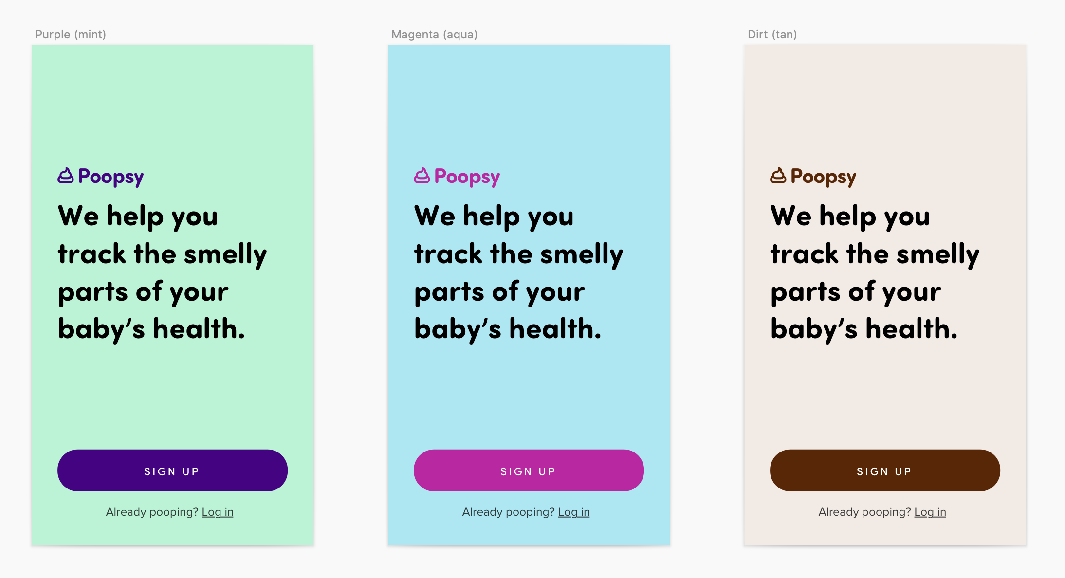
Somehow, a minty fresh theme felt less mischievous than just plain misplaced. Ultimately, I picked the variant to the right — I mean, it is a poop app.
With these two in hand, I had the fundamentals of my visual style nailed down…
…and could start actually working on screens.
How the system was helpful
Defining the colors up front forced me to keep things simple. And once I knew my typographical sizes and styles, weighting elements correctly was easy.
But the most helpful guidance ended up being the three design principles — confident, simple and mischievous. I found myself referring to them again and again. For POLITICO’s election forecast, I now knew that picking principles would be one of my most important first steps.
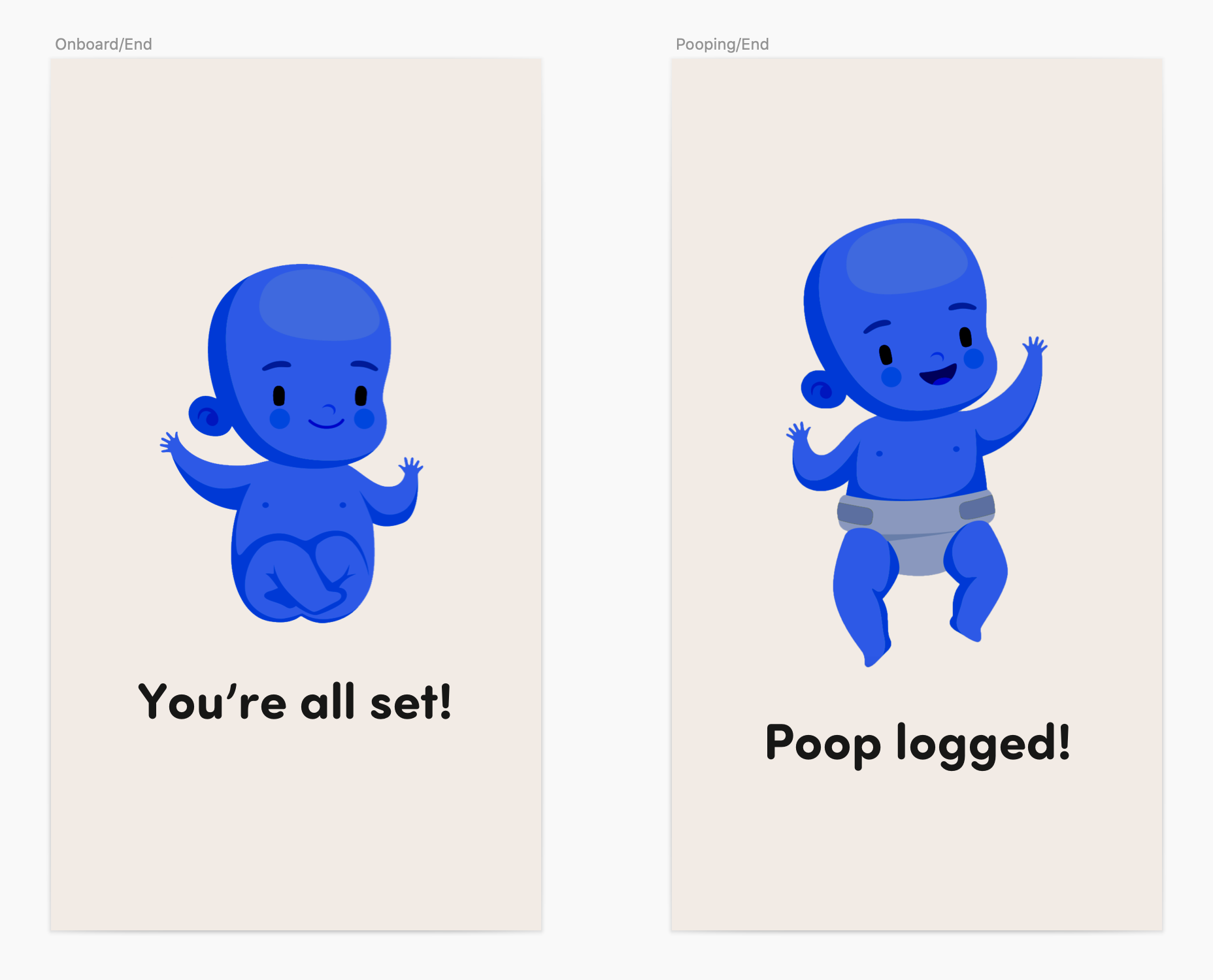
I could write a whole second blog post about how I designed Poopsy and built/de-duped component styles. Suffice it to say it was a lot of fun, and introduced me to Poopsy’s mascot, whom I’m calling Toots:
If you want to see the whole app, I’ve got an inVision prototype rigged up. Accepting pitches from angel investors!